
Not Fit to Print: When Good Design Goes Bad
MEDIA, 13 Apr 2015
Anna Flagg and Moiz Syed, AJ+ On the News - TRANSCEND Media Service
A Lesson from The New York Times on How to Mislead with Numbers
2 Apr 2015 – On July 31, 2014, the New York Times published an interactive article about the Israeli assault that was underway in Gaza. The conflict had claimed 1,472 lives by the publication date: 1,408 of them Palestinian, 64 Israeli.
In an expertly designed data visualization, the Times guided us through its own version of events, which boils down to: Hamas started it, and Israel responded in self-defense. Data from the last three flare-ups is included in the same way, gently suggesting to readers that this is a pattern.
What follows is a breakdown of some ways that design can be misused to tell a biased story. TLDR: This New York Times article reminds us that design is just as much an editorial tool as it is a tool of aesthetics, usability and user experience. Use your power as a designer wisely.
A common misconception about data journalism is that it’s somehow less biased than traditional print journalism. Use of data lends an air of objectivity and legitimacy to a piece of journalism, and that goes double when it’s beautifully visualized. The journalist who made this data–filled article must be being honest with us, because…data. The numbers can’t lie, right?
Let’s get into some of what we’ve learned from the interactive article in question:
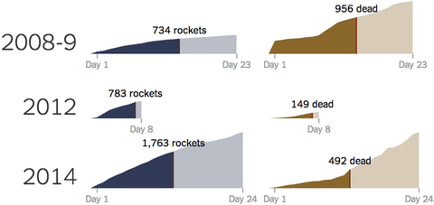
- Mislead With Proximity
Two pieces of data are visualized side by side in this article: total rockets fired from Gaza into Israel, and total deaths.
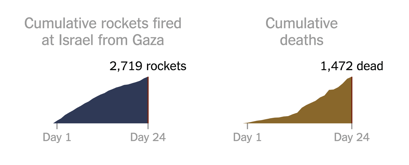 If you think cause and effect here, you’re wrong. But don’t feel bad, it’s not your fault.
Anyone who doesn’t know a lot about the Israeli–Palestinian conflict would, considering the proximity of these two graphs, make the natural assumption that the rockets visualized on the left caused the deaths visualized on the right. Untrue.
By the Times’ own reporting, vastly more people were killed by Israeli airstrikes and ground aggression than were killed by Hamas rockets.
Someone with more background knowledge would realize that Hamas rockets didn’t kill the vast majority of these people, but they may infer from the visualization that the rockets justified Israel’s response as an act of self–defense. And if you didn’t think that, don’t worry — the Times included some helpful text [emphasis theirs] to make sure you get there: “The American government publicly supports Israel’s right to defend itself but warns against civilian casualties.”
Either way, that’s editorializing on the part of the Times. It might be suitable for an opinion piece (maybe by Bill O’Reilly?), but not for an article in the New York Times.
Whichever way you interpreted it, the Times used the proximity of these two datasets to suggest that responsibility for the deaths lies with the Palestinians.
- Omit Confounding Data
Let’s talk more about responsibility.
Notice that the Times has chosen to show total deaths in both Israel and Gaza, but the data representing the violence that presumably caused these deaths is shown only on the Gaza side.
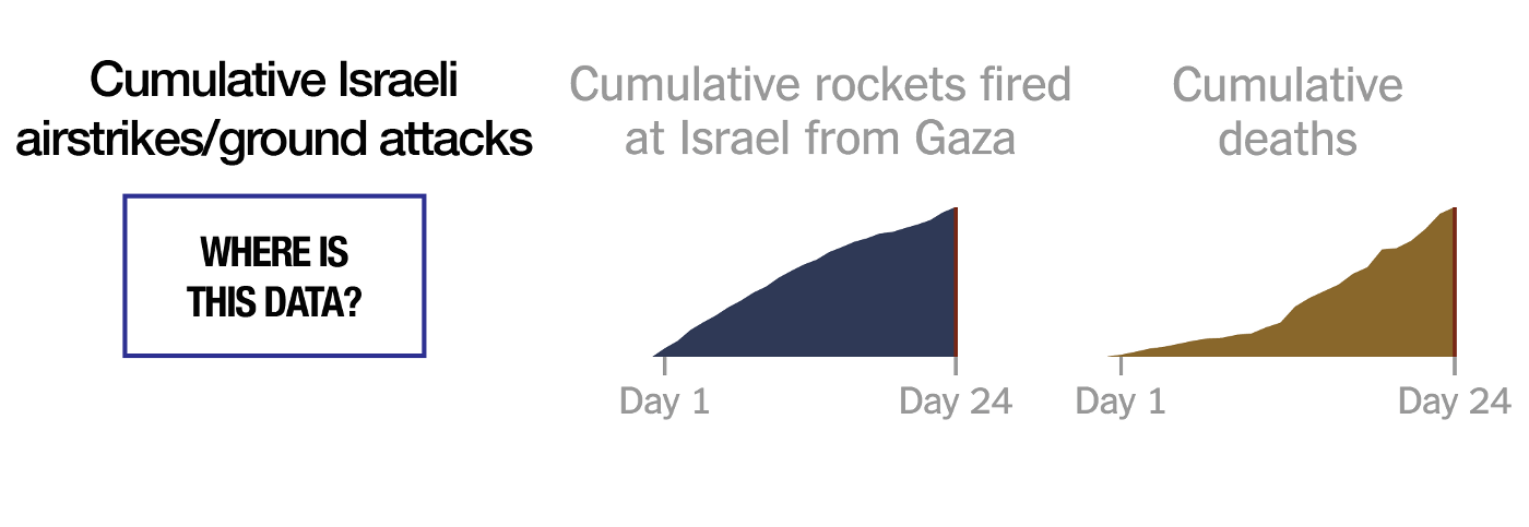 Data about Israeli military action? Anyone? Bueller?
No corresponding data is included to depict Israel’s airstrikes or ground invasion. (Let alone the occupation.)
The idea that the Israeli–Palestinian conflict includes violence from both sides is not controversial. Everyone knows it. (Yes, everyone.) Why does the Times refuse to acknowledge it in its data visualization?
- Obfuscate Inconvenient Data
Speaking of ignoring inconvenient information — you might have noticed that the graphs above show both Israeli and Palestinian deaths grouped together visually.
Hovering over a point will prompt a breakdown of how many deaths occurred on each side, written out in text, but there’s no visual representation of this information. If the reader does notice and choose to use this functionality, it’s a laborious task to extract the trend.
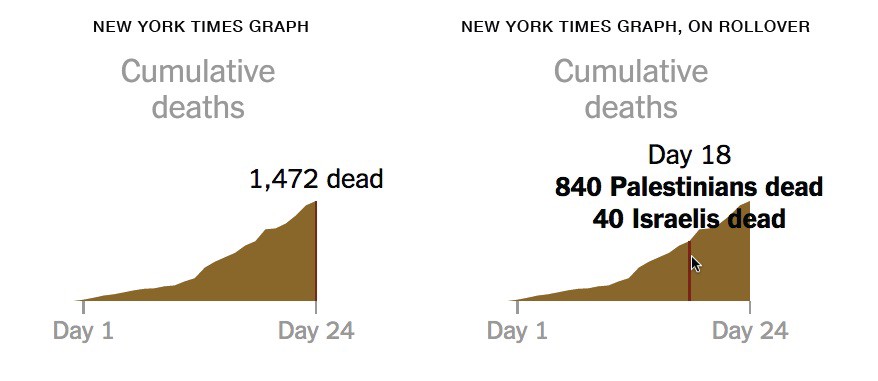 The breakdown of Israeli/Palestinian deaths is available only on hover, and is only shown in text, not visually. This design choice makes the data and the trend much more difficult to see.
So why did the Times decide to do that, when it is a more natural design decision to color the two pieces of data differently, and thus reveal more information in a usable way?
Let’s see what happens when you do that:
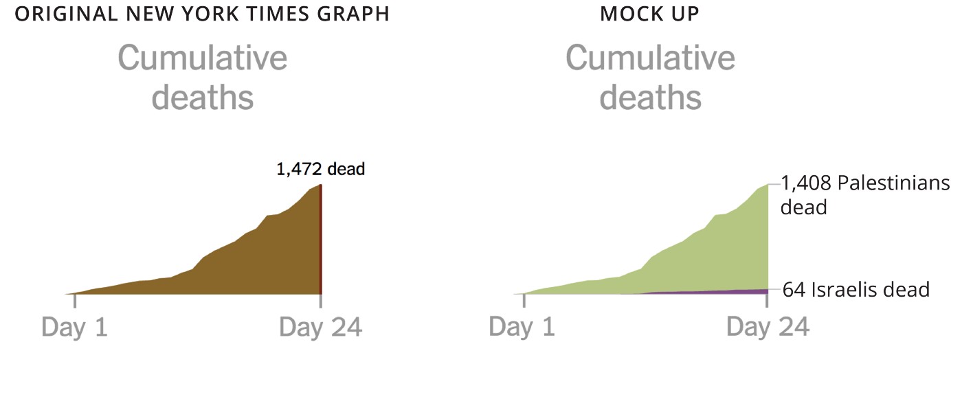
Original Times graph on the left. What might have been on the right.
The figure on the left is the original graph from the Times, and the one to the right is a mock-up of what it would have looked like had they chosen to separate Israeli and Palestinian deaths.
The graph to the right tells quite a different story, doesn’t it?
- Manufacture Patterns
In each of the several steps marked in the article, data is included from the three most recent flare-ups in the Israel–Gaza conflict. The design is consistent throughout, with each dataset manipulated into the impossibly simplistic narrative presented.
The goal of this repetition is to make sure the reader agrees that not only is the Times’ narrative accurate for the most recent crisis, but that it also constitutes a well–established pattern: Hamas started it, and Israel responded in self-defense.
It works, too:
**********
@declankenny94 Hamas is 100% of the time the aggressor. Israel has no problem living in peace. http://nyti.ms/1ofzY43
In Gaza, a Pattern of Conflict
Similarities and differences in the last three major conflicts between Israel and Hamas.
**********
- Don’t Forget the Old-Fashioned Way
Once you’ve done all of the above, don’t forget you can always further manipulate how viewers perceive your data using leading text. Just to make sure everybody really gets it.
Let’s take a look at the very first sentence in this article: “Since Israel withdrew from the Gaza Strip…” [emphasis added].
Almost the entire international community agrees that Israel is currently imposing an occupation on Gaza. However, the Times piece insists that its readers begin with the simplistic premise that “Israel withdrew.”
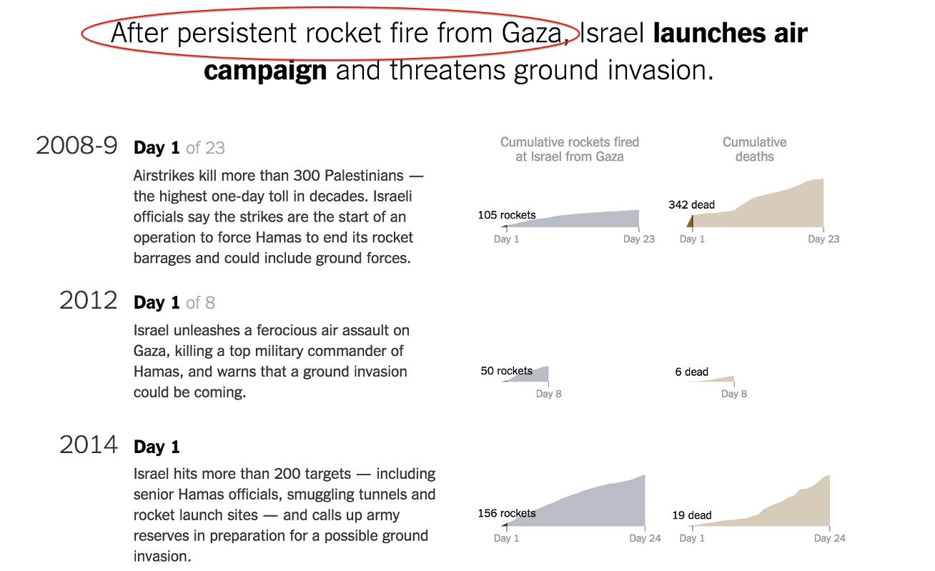
Other phrases in the article are similarly misleading. For instance, reports of Israeli military action are frequently tempered with language providing some sort of reason or justification. Take the below headline: “After persistent rocket fire from Gaza, Israel launches air campaign…” Read: Gaza was asking for it.
 Israeli aggression is frequently “justified” in the article text. Similar justification is not included for Hamas violence. Editorializing much?
The Israel–Palestine conflict is a complex struggle, a series of actions and reactions that has spawned decades of violence. Every act has a reason behind it – probably many reasons – and if the Times sees fit to justify Israeli airstrikes with Hamas rocket fire, it is their obligation to also cite the reasons for that rocket fire. At the very least, this should include acknowledgement of the occupation.
If, on the other hand, they decide that getting into reasons is too complex for their scope, they should be consistent and provide no justifications for either side.
As this article includes attempts to justify Israeli violence both visually and through text while providing no similar justifications for Hamas, the result is a completely one–sided story.
Some of the news that’s fit to print.
httpv://www.youtube.com/watch?v=PQhEBCWMe44#t=11
The Real Lesson: The Power of Design
The real lesson of this New York Times interactive article is that design is just as much an editorial tool as it is a tool of aesthetics, usability and user experience.
An institution like the New York Times is a powerhouse of design and analytical talent, as well as public trust. The Times is at the top of the field when it comes to data visualization: While other legacy news organizations struggle to produce information graphics that are legible (let alone compelling), the Times has created some of the most beautiful and informative pieces on the web. As such, they have a responsibility to use their considerable talents responsibly.
That goes for all designers, journalists, data visualizers — anyone who works with data to communicate with the public. When you’re designing a data–driven narrative, make sure the story you’re trying to reveal is the story the data is actually telling.
If you have to torture the data to get it to say what you want, it might just be trying to get you to stop.
And please, listen to it. Stop.
_______________________________
Anna Flagg: I’m a designer and a data journalist. I like making things.
AJ+ On the News: AJ+ is a global news community that highlights human struggles and achievements, empowers impassioned voices, and challenges the status quo. Here, we take a deeper look at the stories you are following.
Thanks to Moiz Syed, David Cohn.
DISCLAIMER: The statements, views and opinions expressed in pieces republished here are solely those of the authors and do not necessarily represent those of TMS. In accordance with title 17 U.S.C. section 107, this material is distributed without profit to those who have expressed a prior interest in receiving the included information for research and educational purposes. TMS has no affiliation whatsoever with the originator of this article nor is TMS endorsed or sponsored by the originator. “GO TO ORIGINAL” links are provided as a convenience to our readers and allow for verification of authenticity. However, as originating pages are often updated by their originating host sites, the versions posted may not match the versions our readers view when clicking the “GO TO ORIGINAL” links. This site contains copyrighted material the use of which has not always been specifically authorized by the copyright owner. We are making such material available in our efforts to advance understanding of environmental, political, human rights, economic, democracy, scientific, and social justice issues, etc. We believe this constitutes a ‘fair use’ of any such copyrighted material as provided for in section 107 of the US Copyright Law. In accordance with Title 17 U.S.C. Section 107, the material on this site is distributed without profit to those who have expressed a prior interest in receiving the included information for research and educational purposes. For more information go to: http://www.law.cornell.edu/uscode/17/107.shtml. If you wish to use copyrighted material from this site for purposes of your own that go beyond ‘fair use’, you must obtain permission from the copyright owner.