
Covid: The Big Picture in 7 Charts
EDITORIAL, COVID19 - CORONAVIRUS, 5 Oct 2020
Swiss Policy Research - TRANSCEND Media Service
1 Oct 2020 – Covid globally, compared to the flu, in nursing homes, in the USA, in Sweden, compared to epidemiological models, and the economic impact of political reactions.
1) Gobal covid “cases” and deaths vs. all-cause deaths
Chart number one shows global covid deaths by September in blue (about 1 million) versus global all-cause deaths in purple (about 40 million). The chart also shows the cumulative number of global covid “cases” (i.e. positive PCR tests) – the so-called “casedemic” on top of the pandemic.
In contrast, the UN expects that the political reaction to the pandemic may put the livelihood of up to 1.6 billion people at immediate risk and may, by the end of 2020, push an additional 130 million people “to the brink of starvation” and an additional 150 million children into poverty.
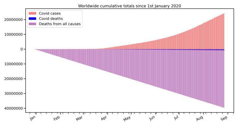
Global covid deaths and “cases” vs. global all-cause deaths. (Data: OWD)
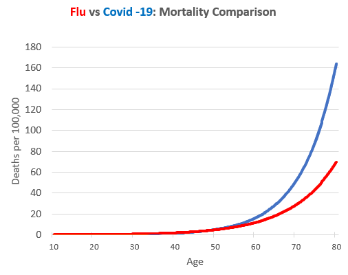
2) Covid mortality vs. flu mortality
Chart number two compares mortality by age of covid and seasonal influenza (based on US CDC data). Below 50 years, influenza is somewhat deadlier than covid; above 50 years, covid is quickly getting deadlier than seasonal influenza (for which vaccines are available).
This “close to natural” mortality profile explains the very high median age of covid deaths in most Western countries (80 to 85 years in Europe, about 78 years in the US).
Overall, in Western countries a severe seasonal to medium pandemic influenza remains the best comparison to covid in terms of overall lethality and mortality. In non-Western countries, including Japan and most of Africa, covid mortality appears to be comparable to seasonal influenza.
3) The role of nursing homes
Chart number three compares covid lethality (IFR) between the entire population (including nursing homes) and the non-nursing home population in Belgium (the hardest hit country in Europe; nevertheless, Belgian peak mortality is comparable to flu waves in the 1950s/60s.)
In most Western countries, nursing homes account for about 40% (Germany) to 80% (Canada and some US states) of all covid deaths, but encompass only about 0.6% of the population; their IFR (about 30%) is about 100 times higher than for the general population (about 0.3%).
When calculating and communicating IFRs, it is therefore crucial to distinguish between the nursing home and the non-nursing home population in order to provide meaningful values. Nursing homes require not a general lockdown, but a targeted, and humane, protection.
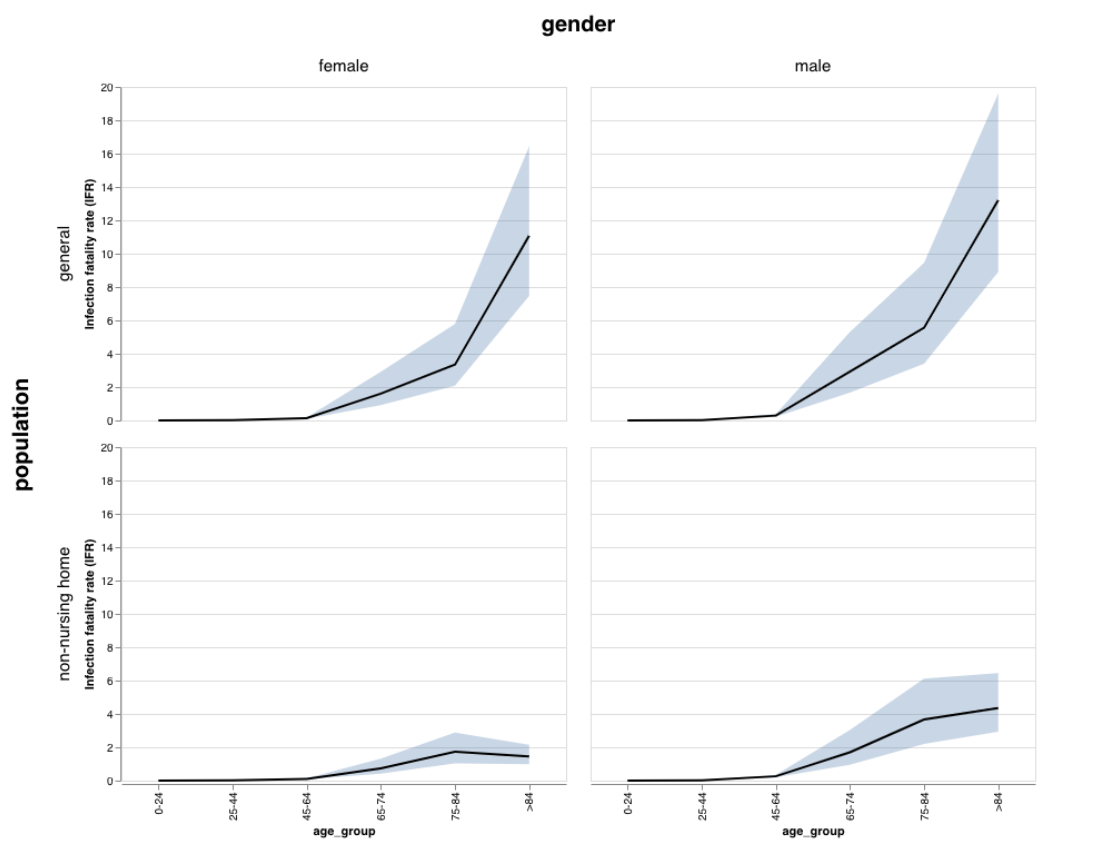
Belgium: IFRs in entire population vs. non-nursing home population (Molenberghs)
4) Covid mortality in the USA
Chart number four shows monthly mortality in the USA since 1960. Regarding covid, the US is one of the hardest hit Western countries; nevertheless, its peak monthly mortality (driven by the Northeast region) is comparable to the strong influenza waves of the 1960s.
If covid had hit the US in the 1960s, its impact would have been much lower, due to a younger population, fewer nursing homes (which account for about 50% of US covid deaths), and much lower metabolic disease prevalence (i.e. diabetes, obesity and cardiovascular disease).
However, in much of the US (and Europe), coronavirus antibody prevalence is still below 10% (compared to values between 20 and 50% in global hotspots). It is therefore possible that the new coronavirus will cause additional deaths if high-risk population groups get infected. On the other hand, both intensive and early treatment options have improved in the meantime.
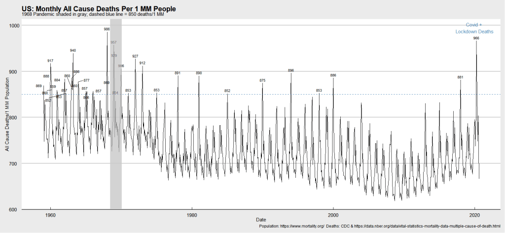
US: Monthly all-cause deaths since 1960 (Whelan/CDC)
5) Covid mortality in Sweden
Chart number five shows monthly mortality in Sweden since 1851. Sweden did not impose a covid lockdown, did not introduce a face mask mandate, and has one of the lowest intensive care bed capacities in Europe (two times lower than Italy). Nevertheless, its peak mortality is comparable to the strong seasonal flu waves of the 1990s. By September, Sweden was the only European country with decreasing daily coronavirus infection numbers.
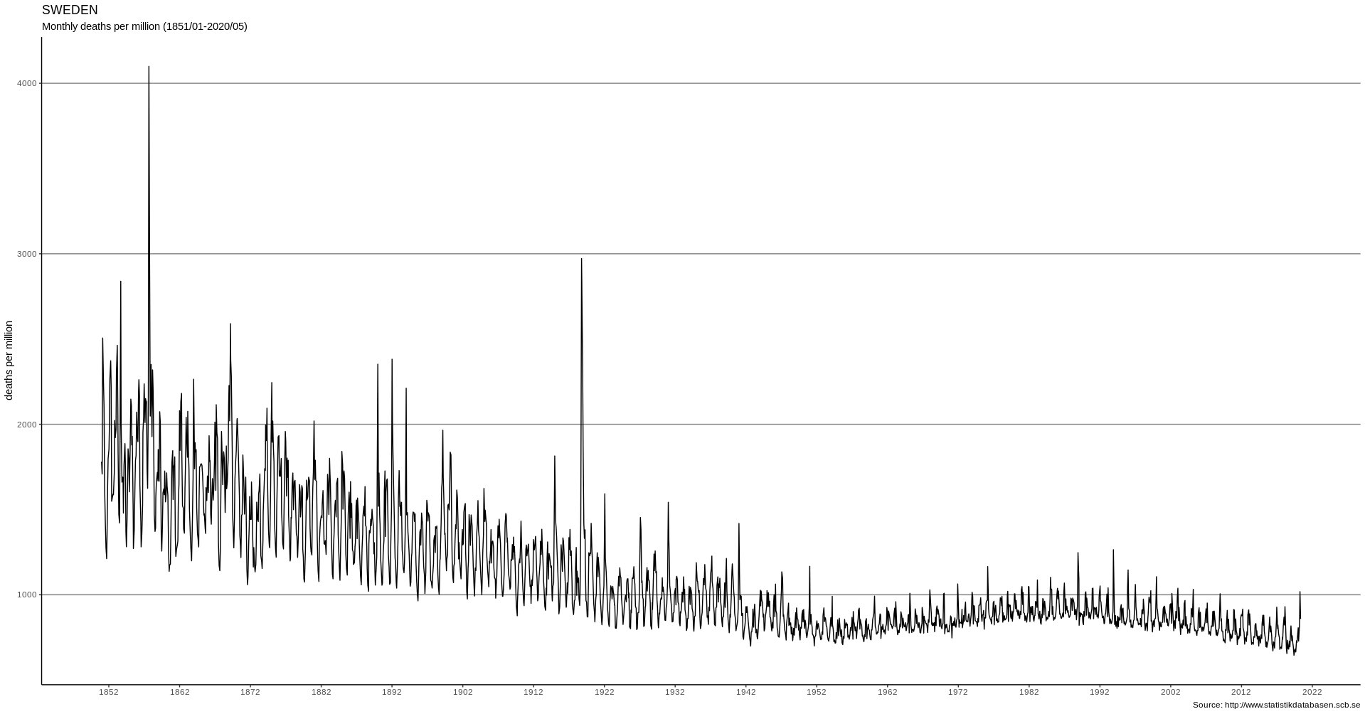
Sweden: Mortality since 1851 (JH/FOHM)
6) Epidemiological models vs. reality
Chart number six shows covid mortality in Sweden predicted by Imperial College London (professor Neil Fergusson) without measures (orange) and with moderate measures (gray), compared to the actual mortality curve (blue). 70% of Swedish deaths occurred in nursing facilities; mortality in people below 65 remained below the five-year average.
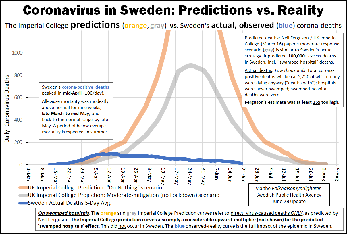
Sweden: Predicted deaths vs. reality (HTY/FOHM)
7) Economic and social impact of political measures
Chart number seven shows US job losses in post-1945 recessions. The political reaction to the new coronavirus, notably the lockdowns, has caused the worst employment recession since 1945, putting millions of people out of job and bankrupting tens or hundreds of thousands of businesses.
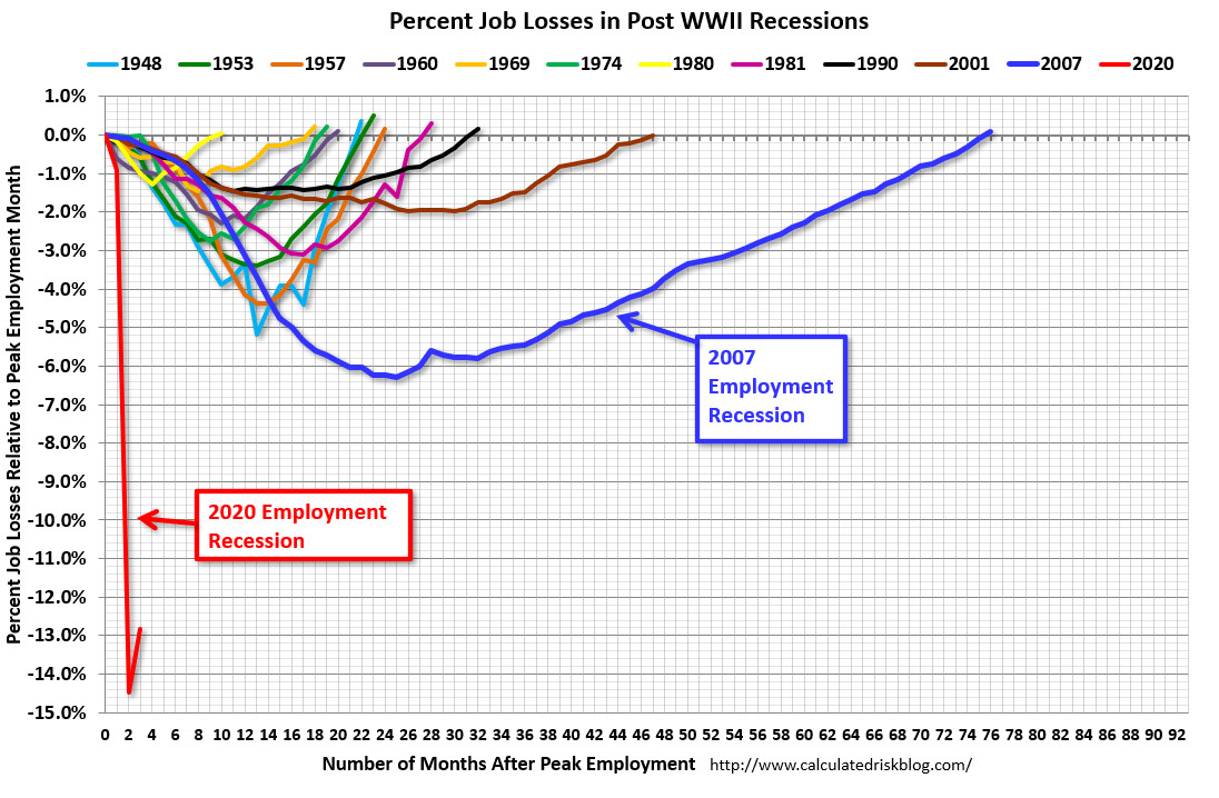
US recessions in comparison (BLS / CRB)
Conclusions
Covid is a very serious public health issue, but:
- Talking about “cases” as if these were sick people is misguided.
- Talking about IFRs (lethality) without distinguishing between the general population and nursing homes, as well as early and late pandemic phase, is misguided.
- Saying covid is “worse than the flu” without saying for whom, is misguided.
- Saying the recession is “due to covid”, not the political reaction, is misguided.
- Saying epidemiological models have been accurate and helpful, is also misguided.
See also
__________________________________________
![]() Swiss Policy Research, founded in 2016, is an independent, nonpartisan and nonprofit research group investigating geopolitical propaganda in Swiss and international media. SPR is composed of independent academics that for personal and professional reasons prefer to protect their identities, and receives no external funding; there are no financial sponsors or backers. Our articles have been published or shared by numerous independent media outlets and journalists, among them Julian Assange, and have been translated into more than two dozen languages.
Swiss Policy Research, founded in 2016, is an independent, nonpartisan and nonprofit research group investigating geopolitical propaganda in Swiss and international media. SPR is composed of independent academics that for personal and professional reasons prefer to protect their identities, and receives no external funding; there are no financial sponsors or backers. Our articles have been published or shared by numerous independent media outlets and journalists, among them Julian Assange, and have been translated into more than two dozen languages.
Tags: Airborne contagion, COVID-19, China, Community, Compassion, Coronavirus, Cuba, Economy, Empathy, Environment, Health, Lockdown, Orthomolecular Medicine, Pandemic, Public Health, Research, Science, Science and Medicine, Swiss Policy Research, United Nations, WHO
DISCLAIMER: The statements, views and opinions expressed in pieces republished here are solely those of the authors and do not necessarily represent those of TMS. In accordance with title 17 U.S.C. section 107, this material is distributed without profit to those who have expressed a prior interest in receiving the included information for research and educational purposes. TMS has no affiliation whatsoever with the originator of this article nor is TMS endorsed or sponsored by the originator. “GO TO ORIGINAL” links are provided as a convenience to our readers and allow for verification of authenticity. However, as originating pages are often updated by their originating host sites, the versions posted may not match the versions our readers view when clicking the “GO TO ORIGINAL” links. This site contains copyrighted material the use of which has not always been specifically authorized by the copyright owner. We are making such material available in our efforts to advance understanding of environmental, political, human rights, economic, democracy, scientific, and social justice issues, etc. We believe this constitutes a ‘fair use’ of any such copyrighted material as provided for in section 107 of the US Copyright Law. In accordance with Title 17 U.S.C. Section 107, the material on this site is distributed without profit to those who have expressed a prior interest in receiving the included information for research and educational purposes. For more information go to: http://www.law.cornell.edu/uscode/17/107.shtml. If you wish to use copyrighted material from this site for purposes of your own that go beyond ‘fair use’, you must obtain permission from the copyright owner.
Read more
Click here to go to the current weekly digest or pick another article:
EDITORIAL:
- Are Europe’s Leaders Ignorant — or Are They Lying?
- The Worker’s Pitch
- Elon Musk, SpaceX, and the Dogma of Ownership Rights
COVID19 - CORONAVIRUS: